The portfolio presentation or dashboard walkthrough is often the turning point in a business intelligence or data analyst interview. Many technically brilliant candidates fail this stage because they give a "button-clicking tour" of their project. They say things like, "First I built this slicer, then I picked a bar chart, and then I wrote this measure." Hiring managers do not want a tour of Power BI desktop features; they want to see how you communicate value to an executive. They are evaluating your data modeling choices, your storytelling ability, and your capacity to convert structural rows of data into strategic operational choices.
This guide provides a bulletproof verbal framework for explaining a Power BI dashboard under interview pressure, ensuring you showcase technical skill and business acumen simultaneously.
Quick Answer: The 4-Step Dashboard Walkthrough Framework
When asked, "Walk me through a dashboard you built," execute this structured framework immediately:


Crack Data Analyst Interviews with Real Company Questions
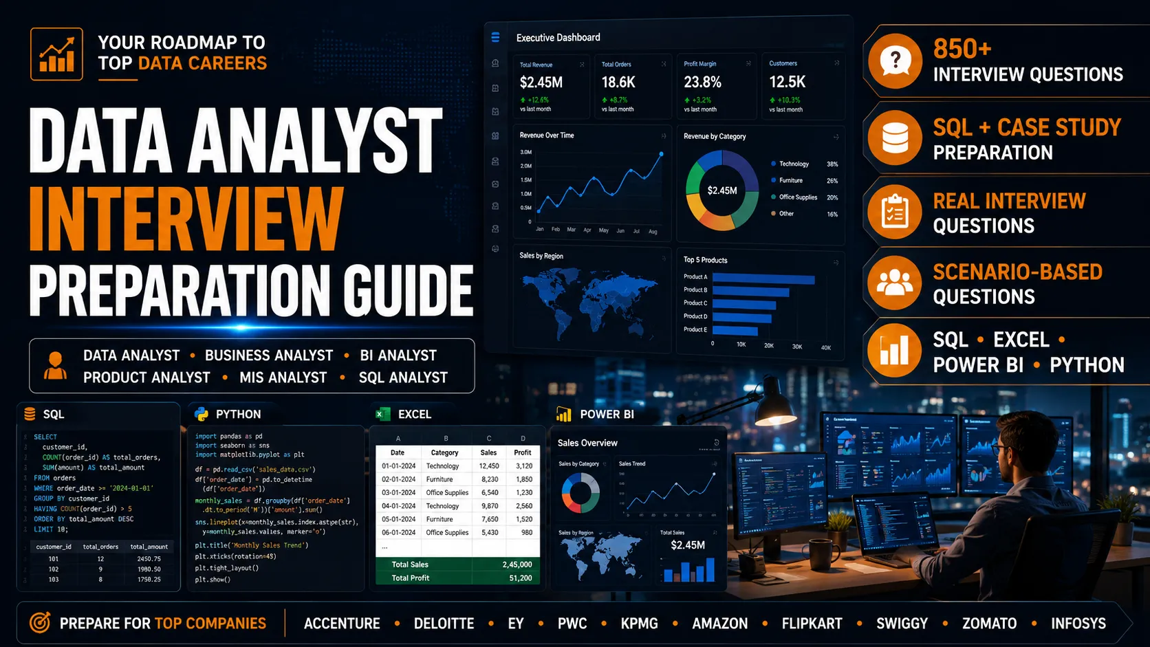
Access 850+ curated Data Analyst interview questions covering SQL, Excel, Power BI, Python, Business Analytics & Case Studies — inspired by interviews at top companies and MNCs. Designed to help freshers and professionals prepare smarter for real interviews.
Inspired by Interview Trends Across
Step 1: Establish the Business Context (The "Why")
Direct Answer:
Never begin by showing data visuals. Always start by framing the corporate environment, the target end-user audience, and the core metrics that dictate project success.
Real Interview Context:
Hiring managers need to know that you understand why the report exists. If you built an executive sales dashboard, explain that the VP of Sales was losing visibility into quarterly margins due to fragmented CRM reports.
Avoid generic statements like "I wanted to look at sales trends." Instead, use targeted industry language:
"The objective of this project was to provide the regional operations team with real-time visibility into logistics bottlenecks and shipping delays that were directly causing a 4% drop in our quarterly customer satisfaction score (CSAT)."
Step 2: Explain the Technical Blueprint (The "How")
Structured Explanation:
Once the problem is framed, pivot seamlessly to your engineering decisions. This is where you demonstrate your technical credibility without overwhelming a non-technical listener.
Summarize your backend and frontend pipeline infrastructure choices cleanly:
Mention how you handled messy source data using Power Query or SQL views (e.g., merging structural discrepancies, cleaning missing dimensions, managing mixed date configurations).
Explicitly declare that you built a clean Star Schema. Mention your dimensions (e.g., Customer, Product, Calendar) and your central fact tables (e.g., Orders, Shipments). Emphasize that you used one-to-many, unidirectional relationships to maximize performance.
Call out 1-2 advanced calculations where you manipulated filter context—such as writing a dynamic time intelligence measure or utilizing row-level iterators (SUMX) to fix a grand total visual bug.
Step 3: Conduct an Analytical Deep-Dive (The Data Discovery)
Direct Answer:
Demonstrate how an end-user navigates your report to uncover hidden business vulnerabilities. This transforms your presentation from a static image walk into an active analytical investigation.
Practical Framework Example:
Instead of showing off every visual, focus the interviewer’s attention on one specific, high-value exploratory sequence.
Step 4: Quantify the Strategic Impact (The Value)
Direct Answer:
End your explanation by linking your technical dashboard directly to a quantifiable business victory or operational improvement.
Ending with, "And that's my dashboard." This leaves the presentation hanging without a clear conclusion.
STAR Method Result Statement:
Conclude with a high-impact summary statement that proves your report created genuine organizational change:
| Operational Metric | Pre-Dashboard State | Post-Dashboard State | Strategic Business Outcome |
|---|---|---|---|
| Reporting Latency | 5 days of manual Excel merging | Fully automated cloud refresh | Saved analytics teams 15 hours per week |
| Inventory Overhead | Constant overstocking of low-margin items | Real-time threshold alerting features | Reduced regional warehouse carrying costs by 8% |
| Executive Decisions | Weekly backward-looking data reviews | Daily forward-looking tracking | Allowed sales leads to pivot ad spend instantly |
Crack Data Analyst Interviews with Real Company Questions
Access 850+ curated Data Analyst interview questions covering SQL, Excel, Power BI, Python, Business Analytics & Case Studies — inspired by interviews at top companies and MNCs. Designed to help freshers and professionals prepare smarter for real interviews.
Inspired by Interview Trends Across
Master Scripts: Bad vs. Good Interview Responses
The Bad Response
Feature-Driven Tour"This is my dashboard. At the top, I put a logo and three slicers for Year, Region, and Segment. Then I made a line chart that shows sales over time. Next to it is a pie chart for product market share, and at the bottom is a matrix table showing profit margins. I used DAX to calculate the profit margin metric."
It describes obvious visual elements that the interviewer can already see. It provides zero business context, demonstrates no technical depth regarding data modeling, and completely fails to articulate business value.
The Good Response
Value-Driven Narrative"I built this Operations Performance Dashboard to help our logistics team tackle escalating fulfillment costs. I started by using Power Query to ingest and clean 2 million rows of disparate shipping logs from an internal database and warehouse spreadsheets. I designed a highly optimized star schema model with a central sales fact table and shared dimensions to ensure fast dashboard execution.
To address the core problem, I authored a custom DAX measure using CALCULATE and ALL to dynamically compute regional shipping lag vs. national averages regardless of user slicing choices. Visually, I implemented a top-down information hierarchy, prioritizing high-level KPI blocks before allowing deep-dives into carrier performance fields. As a direct result of this automated tracking, the fulfillment lead was able to identify underperforming routes and consolidate shipments, lowering our average delivery window by 1.2 days and saving over $40,000 in carrier penalties."
Don't just memorize. Practice with Industry Experts.
Theory only gets you so far. Book a 1:1 mock interview with Senior Data Analysts from top product companies and get actionable feedback.
Best Practices for Presenting a Dashboard in an Interview
Lead with the Metric Hierarchy
Structure your verbal delivery the same way you design clean user interfaces—start with high-level core business goals before diving into specific technical details.
Practice Smooth Transitions
Use narrative bridges to link steps. For example: "Once the business logic was clear, the primary technical challenge was structuring the data model to prevent circular dependencies..."
Acknowledge Challenges Process-First
If asked about a flaw or limitation in your design, explain how you recognized the bottleneck and what optimization steps you took to improve it.
Final Thoughts
Explaining a dashboard effectively is an exercise in empathy. Your goal is to show the interviewing panel that you understand the challenges facing business leaders and that you intentionally use data visualization as a precise diagnostic tool to help guide their operations.
Frequently Asked Questions (FAQ)
Aim for a concise, impactful delivery lasting between 3 to 5 minutes. This provides enough structural detail to establish competence while leaving plenty of room for follow-up questions from the panel.
Never share private corporate data. Instead, duplicate the dashboard file, completely mask or randomize sensitive text fields and revenue values using Power Query generator scripts, and remove identifiable branding elements.
A live presentation is highly preferred because it allows you to demonstrate cross-filtering features, tooltips, and responsive design choices in real time. Always have a static PDF or PowerPoint slide deck backup ready in case of unexpected network drops.
Explicitly state that you avoided flat, wide tables in favor of a clean star schema with distinct fact and dimension tables. Explain how this architecture reduces memory load and optimizes the DAX formula evaluation engine.
Expect questions focusing on your design tradeoffs: "Why did you choose a bar chart instead of a scatter plot here?", "How did you test data accuracy against the source database?", or "How would you scale this design if the data volume tripled?"
Acknowledge the existing infrastructure cleanly: "While the data engineering team maintained the central data warehouse tables, my responsibility was creating custom SQL views, modeling relationships inside Power BI, and engineering the required business metrics."
A top-down layout features aggregate, high-level corporate KPIs across the top row, structural breakdown charts across the middle section, and exhaustive detailed data rows or granular tables at the bottom.
Explain how you gathered project requirements. Mention that you met with end-users early to understand their workflow challenges, ran prototype testing sessions, and updated designs based on actual user feedback.
Yes, if applicable. Mentioning that you configured dynamic Row-Level Security roles to ensure that managers only view data records tied to their specific territory shows high-level enterprise awareness.
Frame it as a detective story. State the unusual visual pattern or metric dip you observed, explain how you used filters or drill-downs to isolate variables, and summarize the root cause you surfaced to management.